Lisa Sparxxx Official Website
Hey there! My name is Lisa Sparxxx, also known as
Lisa Sparks. Welcome to my
official hardcore XXX website, the home of my exclusive
adult content. I’m often referred to as a legendary porn star, and I proudly
represent the small-town country girl vibe with
natural curves that match a curvy country road. My
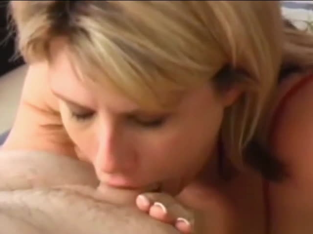
massive 40J-cup boobs are 100% natural. Here you’ll find my complete collection of
exclusive big tits pornstar photos, along with
big tits MILF porn videos, including both
brand-new releases and classic scenes
that helped define my 20-year porn career. Thank you for visiting my official website and supporting my journey.
I can’t wait to connect with you inside and share even more
exclusive adult content.
